The quiet data revolution starts here….hopefully!
9 December 2013 - Toby Blume
Today saw the launch of a new platform aimed at voluntary and community groups, social organisations and citizens with an interest in making better use of data. Data Unity, a project I’ve been working on for the last year or so, was launched this morning at a breakfast seminar close to Silcon Roundabout (that’s Old Street to you and me!). The project, which is being supported by the ‘tech for social good’ funder, Nominet Trust, offers a free and simple way for people to grab a piece of the open data techfest, without having to do post-graduate degrees in statistics or social geography.
Open data, big data, linked data, even ‘good data’ fill my twitter stream and even on occasion transcend to ‘real life’ conversations. What’s never been clear to me, is how us non-techies can join the party. And up till now, it’s not been easy.
Data Unity provides a solution to the tech-curious, amateur enthusiasts, or those focussed on achieving positive social outcomes, without any particular knowledge or interest in data.
Based on three simple components, Data Unity allows people to easily explore, visualise and share data. Whether it’s your own humble spreadsheet, or vast data sets from public agencies, Data Unity allows users to explore any aspect of the data and create their own ‘queries’ to gain new insights and answer burning questions. Its simple colour-coded ‘drag and drop’ interface, makes it so simple to interrogate data, even my 9 year old daughter has found using it a breeze.
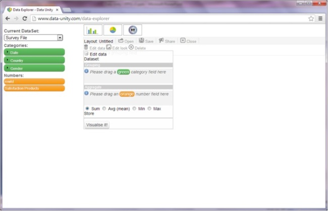
And then, with just the click of a button, you can send the results into your own visualisation – whether it’s on a map, a pie chart or a graph. No more fiddling around with pivot tables in Excel. It’s just click and go.
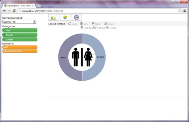
Data Unity’s founder, Kev Kirkland, has produced a great YouTube clip showing how to create an infographic in just 10 seconds. Simples!
And the fun doesn’t stop there…
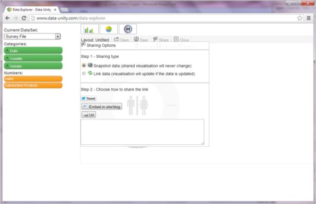
If you want to share your new custom-built visualisation with colleagues or friends, you just choose how you want to share it and away you go. Your visualisation can be embedded on your website or shared on twitter or facebook. And because the site uses linked data, it means that (if you want to) your visualisation will update as the data it’s based on is updated. Giving you the basis for a nifty data dashboard of your very own. Of course, if you don’t want it to change, but want to capture the moment forever, that’s also fine. Just create a snapshot and it’ll leave your image as it is.
Our hope is that now people will start to use Data Unity for themselves and come to see it as an invaluable tool in their toolbox to help them better understand things. Whether that’s gaining fresh insight into the impact they’re having, opening themselves up to their beneficiaries to hold them to account, or providing information in a new more accessible form. Data Unity has the potential to transform the way we engage with and make use of data. And if that sounds like a bold claim, it’s because it is. I genuinely believe this could be the start of something radically transformative.
We’d love to hear your thoughts on Data Unity, how you’ve used it, what you’d like to see it be able to do in the future and whether it’s made a difference to what you do. Do let us know what you think.
You can keep up to date with the latest developments for Data Unity by signing up to the newsletter on our home page.